Relative Frequency Chart

The concept of relative frequency is crucial in understanding the distribution of data in statistics. It refers to the proportion of times a specific value or range of values occurs within a dataset. A relative frequency chart, also known as a relative frequency distribution, is a graphical representation that displays the relative frequency of each data point or category. This chart is essential in data analysis as it helps in visualizing the dispersion of data, identifying patterns, and making informed decisions based on the distribution of the data.
Understanding Relative Frequency Charts

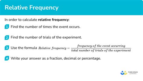
A relative frequency chart is constructed by first determining the frequency of each data point or category, which is the number of times it occurs in the dataset. The relative frequency is then calculated by dividing the frequency of each category by the total number of data points. This gives a proportion or percentage that represents how often each category occurs relative to the entire dataset. The relative frequencies are then plotted on a chart, typically using bars for categorical data or a continuous curve for continuous data, to provide a visual representation of the data distribution.
Constructing a Relative Frequency Chart
To construct a relative frequency chart, follow these steps:
- Data Collection: Gather the dataset you wish to analyze.
- Calculate Frequencies: Determine how many times each data point or category occurs.
- Calculate Relative Frequencies: Divide the frequency of each category by the total number of observations to get the relative frequency.
- Plot the Data: Use the relative frequencies to create a bar chart or histogram for categorical or continuous data, respectively.
| Category | Frequency | Relative Frequency |
|---|---|---|
| A | 10 | 10/100 = 0.10 or 10% |
| B | 20 | 20/100 = 0.20 or 20% |
| C | 30 | 30/100 = 0.30 or 30% |
| D | 40 | 40/100 = 0.40 or 40% |

Applications and Interpretations

Relative frequency charts have wide-ranging applications across various fields, including business, healthcare, social sciences, and more. They are particularly useful for:
- Identifying Trends: Visual inspection of the chart can reveal patterns or trends in the data that might not be immediately apparent from raw data.
- Comparative Analysis: By comparing the relative frequencies of different categories, researchers can draw conclusions about the prevalence or preference of certain attributes within the population.
- Predictive Modeling: Understanding the distribution of data can inform predictive models, helping to forecast future trends or behaviors based on historical data.
Limitations and Considerations
While relative frequency charts are powerful tools for data analysis, there are limitations and considerations to keep in mind. For example, the interpretation of the chart can be influenced by the sample size and the method of data collection. Small sample sizes may not accurately represent the population, and biases in data collection can skew the results.
Key Points
- Relative frequency charts display the proportion of times each value or category occurs in a dataset.
- They are constructed by calculating the frequency of each category, then dividing by the total number of observations to get the relative frequency.
- These charts are useful for identifying trends, comparative analysis, and predictive modeling.
- Interpretation must consider the context, sample size, and potential biases in data collection.
- Relative frequency charts can be applied across various fields, including business, healthcare, and social sciences, to guide decision-making and strategy development.
In conclusion, relative frequency charts are valuable tools in data analysis, offering insights into the distribution and patterns within datasets. By understanding how to construct and interpret these charts, professionals and researchers can make more informed decisions and develop targeted strategies based on the characteristics and trends of their data.
What is the primary purpose of a relative frequency chart?
+The primary purpose of a relative frequency chart is to visualize the distribution of data, showing how frequently each category or value occurs within the dataset, which helps in identifying patterns and trends.
How do you calculate relative frequency?
+Relative frequency is calculated by dividing the frequency of each category by the total number of observations in the dataset.
What are some common applications of relative frequency charts?
+Relative frequency charts are commonly used in market research, healthcare, social sciences, and business for trend identification, comparative analysis, and predictive modeling.